Brand match
Use your brand color to color all buttons and highlights.
Bundle widget colors and custom CSS
Match the bundle widget to your brand with color presets, a custom brand color, CSS, and display toggles.
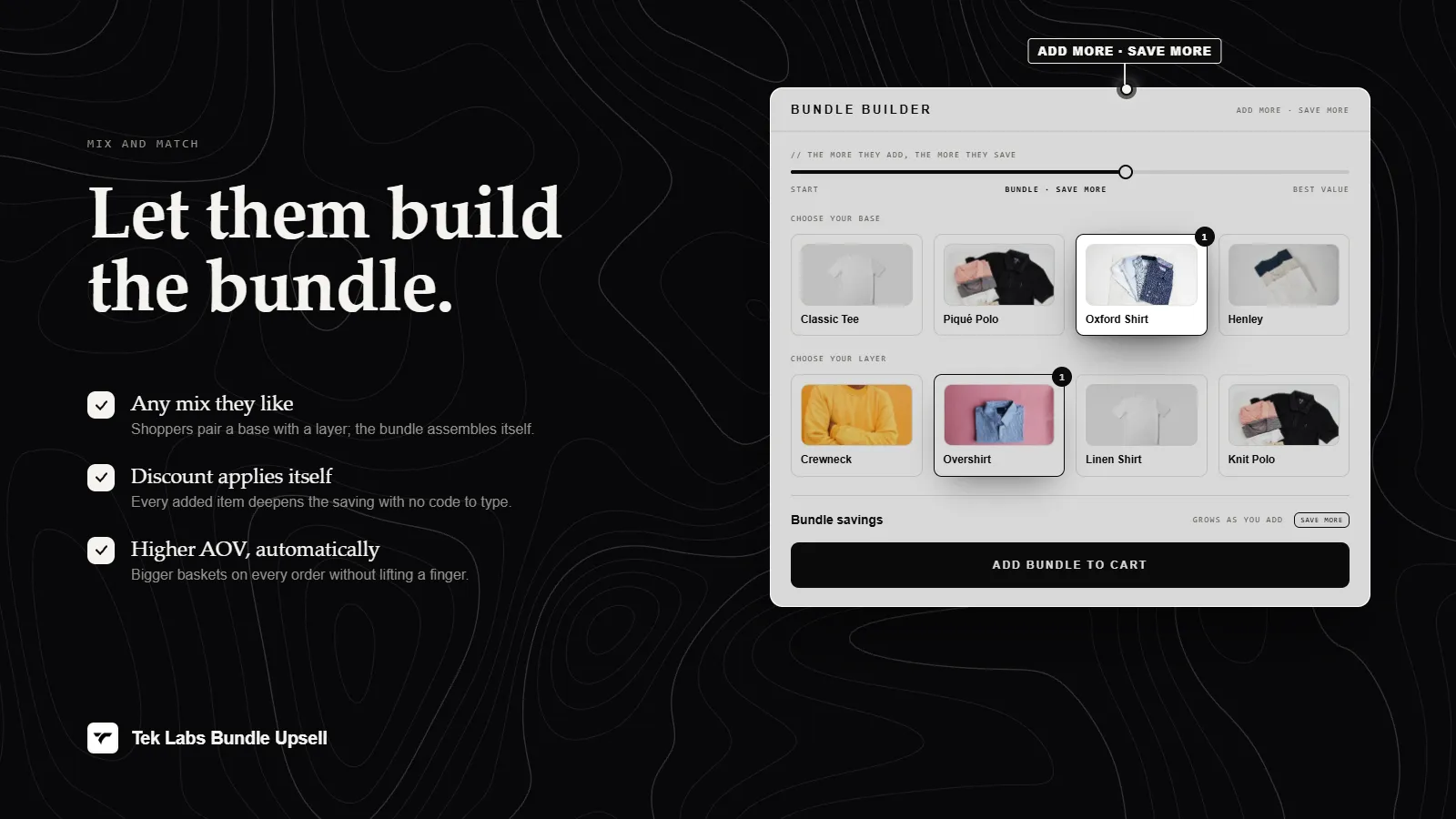
What it is
Mix & Match Bundles gives each campaign a Display step. You can pick a color preset, or choose a custom color and the app derives a full palette from it. Display toggles let you show or hide the progress bar and the variant picker, and a Custom CSS box lets developers fine-tune the widget.
Use it when the default look does not fit your theme. The app also offers to remove the Powered by trademark, which you request through the in-app chat.
For the shopper
Scroll through the steps. The phone shows what the shopper sees at each one; products and prices are an example.
The widget uses your preset or custom color for buttons, borders, and highlights.
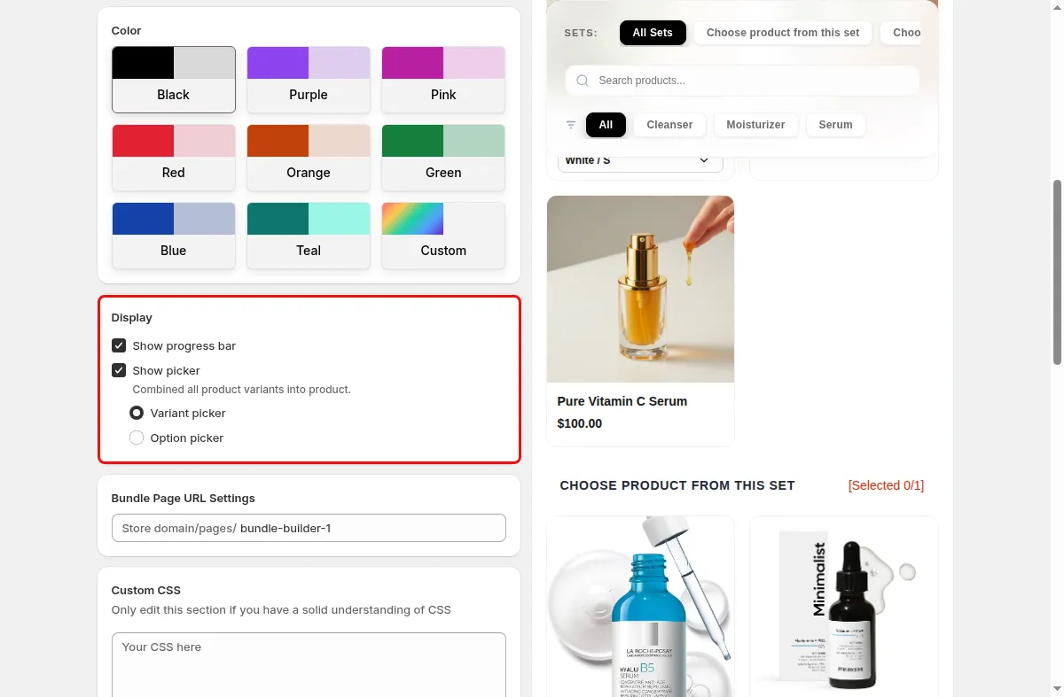
If the progress bar is on, it shows how close the bundle is to the next reward.
If the variant picker is on, variants of each product can be chosen directly in the widget.
Any CSS you added is applied on top of the widget styles.
For you
Options you control
In the campaign editor go to step 2, Display and Color.
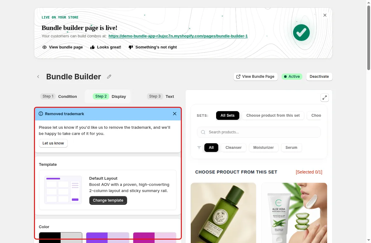
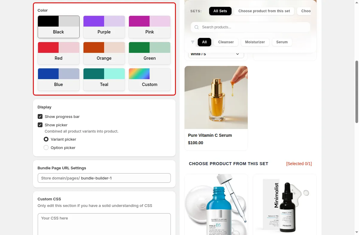
Choose a preset in Colors and Styles, or use the custom color picker.
Under Display switch Show progress bar and Show variant picker on or off.
Open Custom CSS and paste your rules. The editor warns to edit it only if you understand CSS.
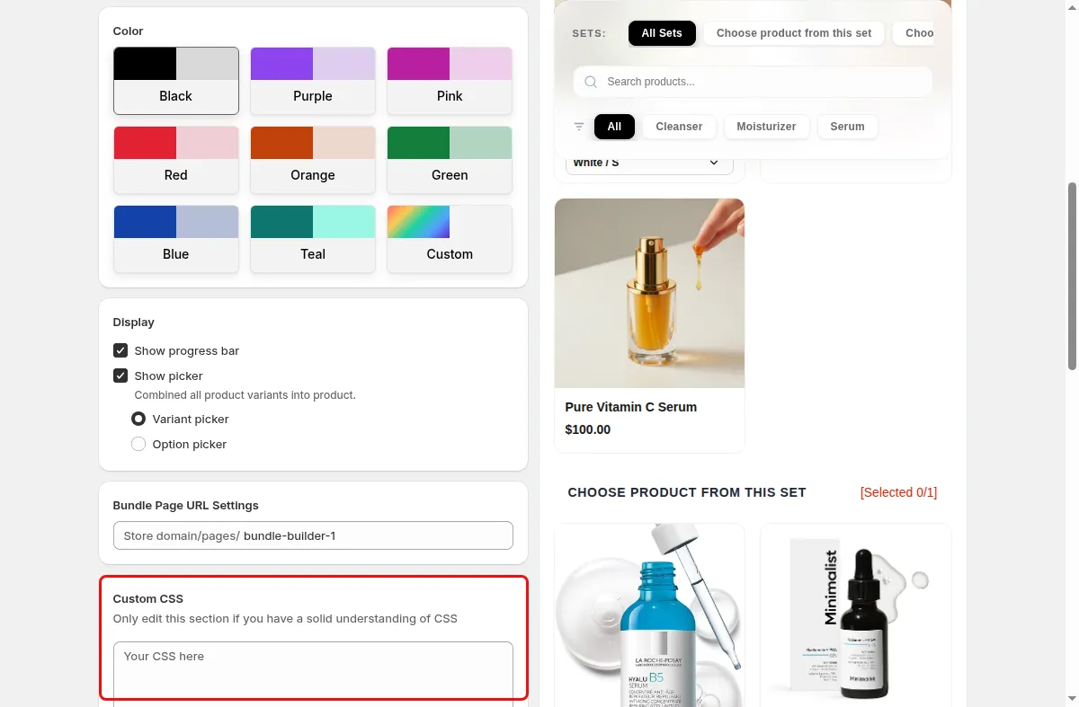
Use the live preview, or maximize it, then Save.
Use cases
Use your brand color to color all buttons and highlights.
Turn off the progress bar for a single-tier offer.
Adjust spacing or fonts with a few lines of CSS.
FAQ
Yes. The custom color option generates a light tint and background from your primary color.
The Display step has a Removed trademark section with a Let us know button that sends the request to the Tek Labs team.
Yes. The editor has a Preview panel with a maximize option.
Build-a-box, gift sets, tiered bundle discounts: our team sets it up with you and checks it on your theme before it goes live.
Free plan available. Built for Shopify. Rated 4.9 from 35 reviews.